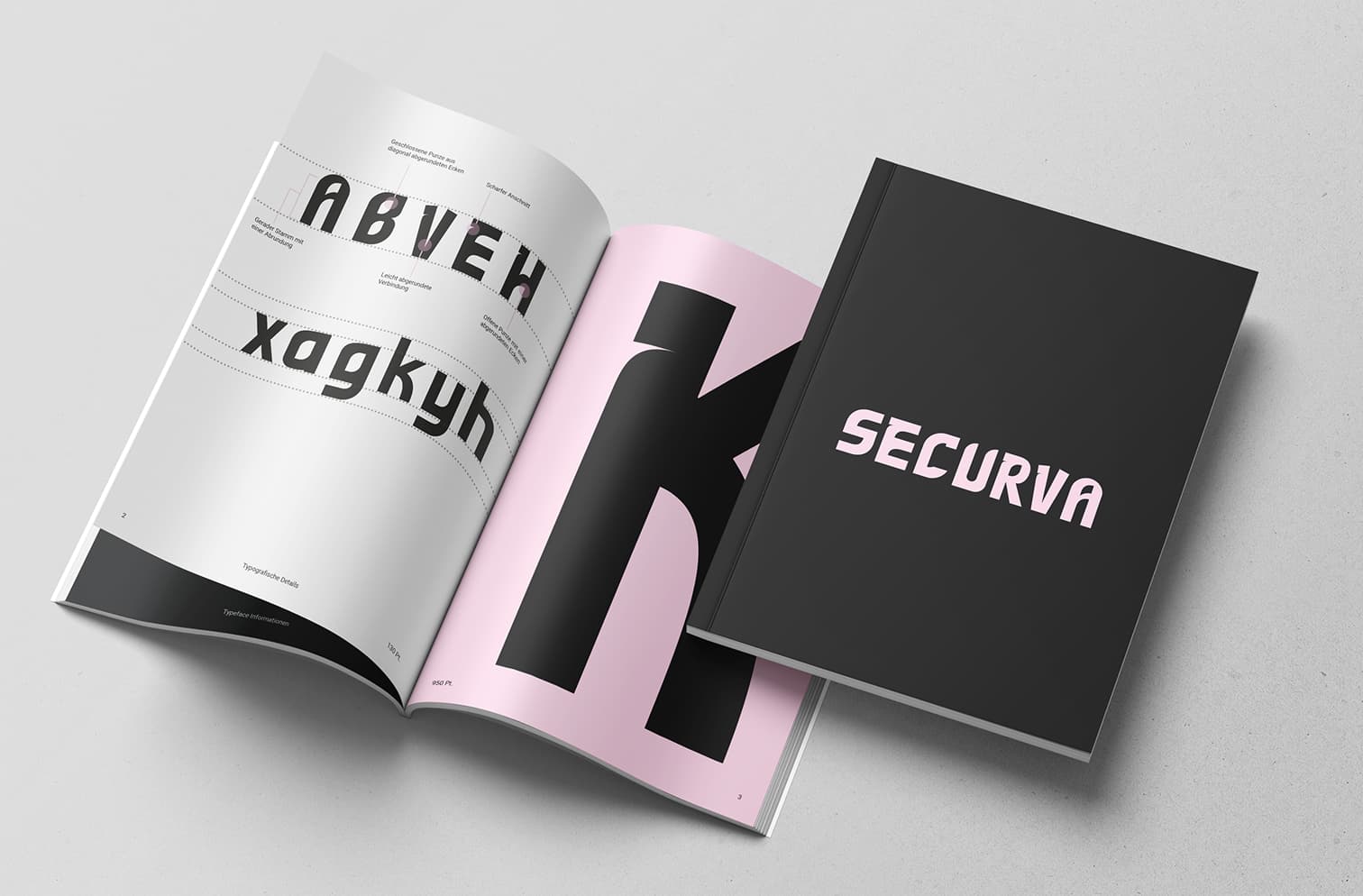
Securva
In my second semester, I designed my own typeface. The goal of the project was to choose an existing typeface as a basis and develop it further. I used the typeface from the logo of the company "Holy" as my starting point.
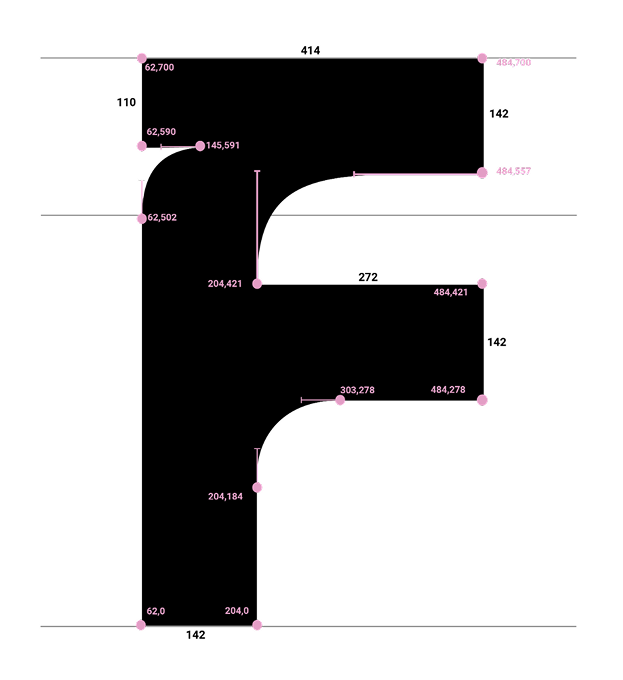
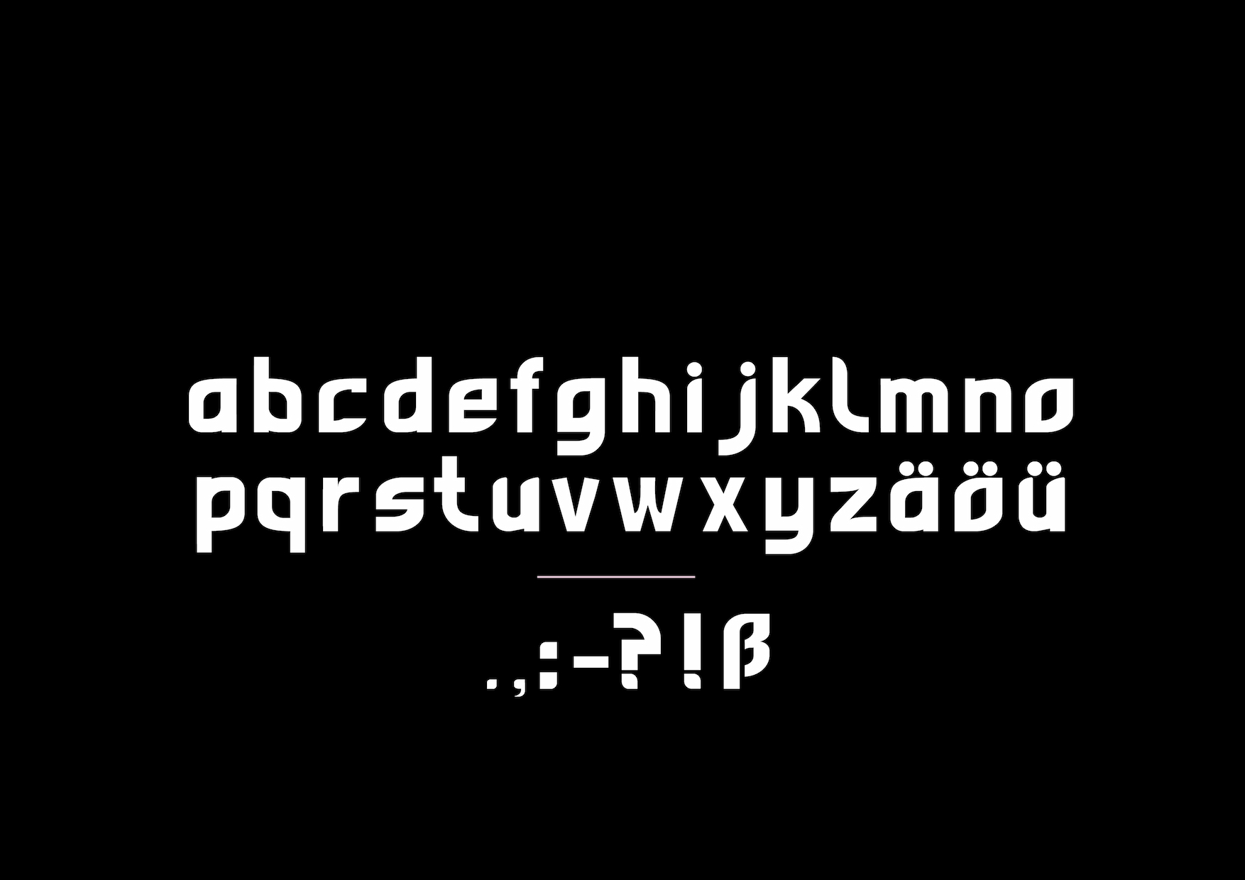
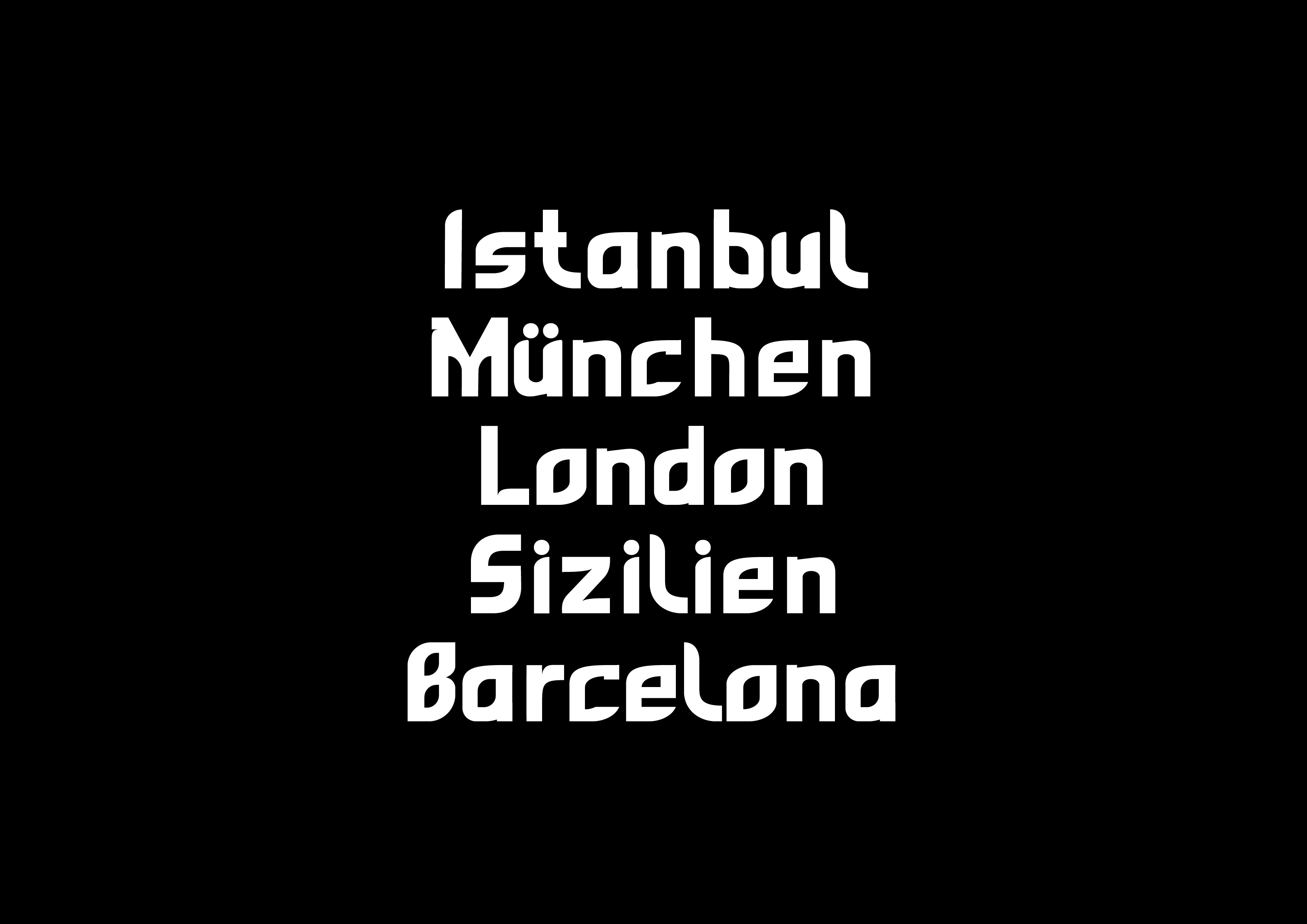
The capital letters of this typeface are characterized by a uniform height, consistent widths, and a clear grid system that considers both vertical and horizontal axes. Curves, counters, and stroke beginnings follow fixed proportions and recurring design principles. Notably, all letters end straight on the baseline and have no open curves. Furthermore, the stem of many letters has a slight bleed. The consistent application of these design rules results in a harmonious and striking typeface, particularly well-suited for use as a display font.